

Project Background
My Role
UX Designer
UX Researcher
Duration
Sep. 2021 – Dec. 2021
Team
Yichen Duan
Athia D. Fadhlina
Melissa Henrey
Kemeng Zhai
Tools
Figma
Mural
Google Forms
Google Drive
Clients:
School Administrators of 370 Jay St.
370 Jay Street is located in downtown Brooklyn, New York. It is built to collaborate all digital media technology related faculties and students to achieve sharing of resources, equipments and any other related information, however, things didn’t go as wish…
UNDERSTAND: Lack of communication = lack of insights.
We began our discovery process by asking: How might we raise awareness and promote collaboration across different programs in 370 Jay Street?
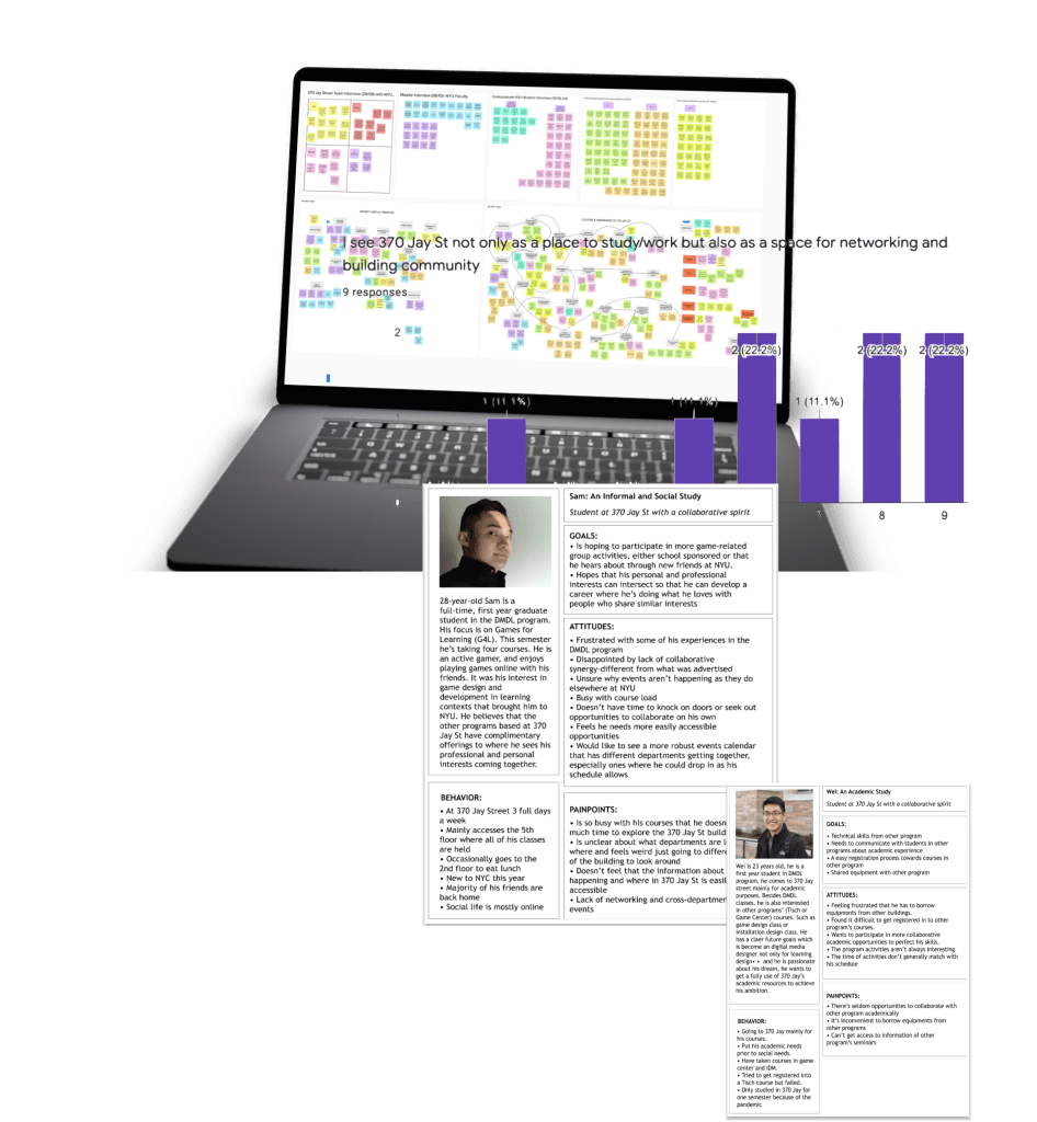
My role was mainly releasing surveys and conducting interviews with the alums, current students and the administrators in 370 J, and summarizing the information patterns and the real user needs. and an interesting thing was found:
The building is actually designed and foundered by the admis, however, the students are the real clients but their voices were not collected within the design process.
And that was the most crucial conflict that caused the failure of the designers’ expectations.

DEFINE: Users’ needs can be so obvious right in the communication.
After figuring out this issue, we mainly focused on the students’ needs and informed the admis about those needs to form better communication. And we figured out that the pain points of our real users were actually very simple and clear:
They want to find people with common interests, both socially and academically, to connect and collaborate.

DEVELOP: Narrowing down can be even more important than covering all.
Therefore, we ideated a social app within the whole building, to address this need. We narrowed it down to two basic parts: social and academic, and added functions of match, message and event. To better collaborate students in the building, we connected the pair up function with the event function so that students could directly find partners to go to the event they are all interested in.
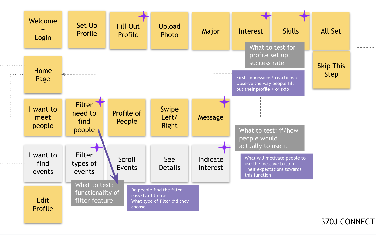
After ideating, the iteration of prototyping (using Figma) the application started. (From low-fi to high-fi)

FINALIZE: Small icon, big difference.
We then made prototypes with Figma, and did usability testing with students inside the building, the comments were really good, with some voices like I really need an application like this, or I’ll definitely use it once it’s launched, etc.
However, I was impressed by one of the comments that “the matching icon with too hearts seem ambiguous to me”. I was shocked:that’s exactly what we were trying to avoid, we wanted the app to be proper for campus use, not to be a social dating app. We definitely changed the icon in the later iterations, and I’ll always keep in mind this takeaway.
After collecting those feedbacks, changes were made to develop new versions of the prototype. Both feedbacks and visual design principles were considered.
Please let me know your usability feedbacks if possible. Send me a message here.
